Postal Panic
"Ever wanted to sort packages in a postal office? WE GOT THE JOB FOR YOU!"
There are tons of packages that come through our Postal Office everyday and we need you help more than ever! Make sure the packages have the right postage to get them where the customer needs!
Post Office Orientation:
FIRST: READ the customer shipping request.
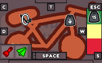
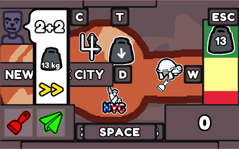
SECOND: Click on the tags around the screen to check how the package can be categorized such as: destination, weight, shipping company and delivery speed.
THIRD: Open the Postage Drawer, and apply the appropriate shipping postage!
Use the scraper to remove a sticker if you apply the wrong one, then apply the correct one!
FOURTH: Don't forget to SEND!
This game was made for Ludum Dare 53 to the theme of "Delivery".
Developed by Rubber Ducks:
Alain Sangalang, Kody Wood, Bo Yu
Music by:
joshuuu https://joshuuu.itch.io/
| Status | Released |
| Platforms | HTML5 |
| Author | Rubber Ducks |
| Genre | Simulation |
| Made with | Unity |
| Tags | Arcade, Ludum Dare 53, Pixel Art, Singleplayer |
| Links | Ludum Dare |


Comments
Log in with itch.io to leave a comment.
what do the number stickers mean?
The number stickers represent different shipping company logos however for gameplay they are found through solving the simple math equation in the customer instructions.
Interesting game! Graphics are nice, simple cutesy graphics. It shows that a lot of care went into it! The gameplay itself is fine, has a dead simple loop that gets quite satisfying once you get into a rhythm, even if once you've done 1 package you basically played through the whole game.
I'm just not sure about the UI. Hiding everything behind buttons probably isn't a bad idea, but the scheme kinda is here I think. It makes sense, for the Comment to be under the key C, or Destination to be under D, but for me It just doens't work. I would MUCH rather have just directional keys. Like the left menu opens with A, right weight menu opens with D, that sorta thing. The way information is presented is also a bit weird. The timer should be a thing that is always visible and reminds the player to hurry up. Hiding it kinda makes it a bit useless, like sweeping your problems under a rug kinda deal. Having all information under the comment except direction (and I guess weight if you dont know it by heart) feels weird too. I feel that the concept wasn't to make a hard game, but it just feels too easy with it. In Papers Please for example, all the data is in a different part which you need to double check, which is fun. And the datas are in a nice in-universe things like passports and not UI elements like here. I haven't got a single clue on how to try to better this UI design but it just doesn't work that well. The number thing is a nice touch, I liked that.
Thanks for the feedback and playing the game!